
I didn't travel to Raleigh, North Carolina, for QuiltCon this year, but I always look forward to the virtual show that follows the event proper. Traveling is expensive, difficult to schedule, and sometimes politically-charged, so having the option to view the quilts from home is a major plus for MQG members. Sure, you can browse photos from attendees on Instagram, but I really enjoy the uninterrupted viewing of the online gallery. So when the link was shared, I eagerly clicked through and browsed the show.
Similar to my "Top 4 Design Trends at Quiltcon 2023" blog post, I've put together 4 trends that caught my eye, from colour to shape, from composition to technique.
Writing these blogs always has me slow down and inspect our community's work a little closer. What are the subtle (or not so subtle) techniques and choices that echo through the quilts we make in any particular moment in time?
There aren't any cosmic forces at play here, but I think colour trends - popular or not - play a role, so too does access to educational content that empowers quilters to step beyond rectangular shapes, and the continuing use of craft and art as a conduit for disseminating our values and points of views to the populace.
Let's have a look at all of these influences at work...
Trend #1: Neutrals: Creams, Coppers, and Browns
I think this trend has always been simmering beneath the surface, but it seems to really have made a statement this year. Neutrals play a critical role in compositions despite getting little recognition. They are the unwavering supporting actors in visual art of any form. They ground colour stories by introducing contrast or by offering a visual break amid a bold network of hues.
The coppers and browns in the pieces below bridge the colour gap between light and dark tones. But you can see that brown and cream fabrics used in Karin Rabe's, Espresso Distortion, makes a beautiful case for neutrals in leading colour roles as well.
Disclaimer: It's hard to say how artwork is influenced by the colour of the year selections made by KONA (Nocturne, a shade of purple) or Pantone (Mocha Mousse, a shade of brown). It's inevitable that the choice of international trend-setters and brands will find their way into the artistic consciousness or annual quilting challenges, which then find their way into a quilt show's roster.


.
Trend #2: Circles: The Eye of the Quilt
The last few years have presented an interesting evolution in modern quilting - challenging techniques that once made quilters seize with anxiety have become less intimidating and integral to the average quilter's toolkit. As such, circles - whether pieced or appliquéd - seem to be a popular design element in recent years. The quilts below showcase this technique with the circular or circle-like element at the centre of the composition. This "eye of the quilt" varies in application from inset, appliquéd, and improvisationally pieced.


Trend #3: Andy Warhol Adjacent
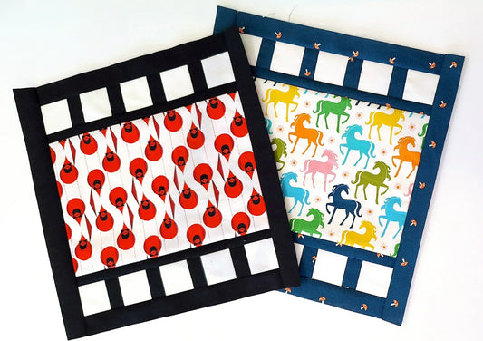
There were several quilts that used repetition and alternating colour placement similar to Warhol's iconic aesthetic in the show. This is most obvious in Ancient Fruit by Carla Resnick. The number of blocks and the size of the grid are effective ways to experiment with elements of the Pop Art movement.


Trend #4: Protest Quilts: Mean What You Text
There was a powerful selection of quilts that used text to express frustration, anger, and pain about this particular moment in history. Sometimes the most direct path to communicating your point of view is not through colour, shape, and composition alone. Sometimes you have to spell it out.
The selections below are excellent examples of how text and design can be paired to articulate a complex concept. Karin Rabe's The Part of History particularly stood out to me. Rabe placed text on a background resembling a lined piece of paper, which effectively transports us to the classroom, the desk, the moment that we asked ourselves that very question while sitting in history class as students.


What trends did you notice at QuiltCon this year? Comment below.


1 comment
Wow, what an honor to have my quilt “Ancient Fruit” be included in this post!